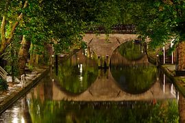
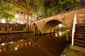
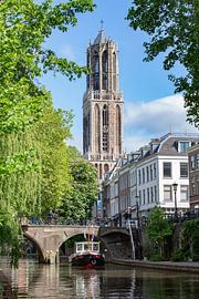
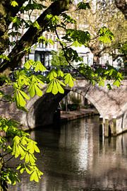
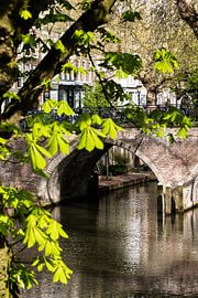
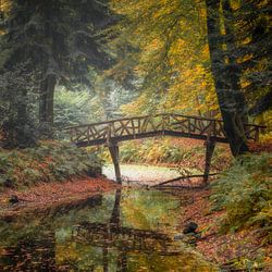
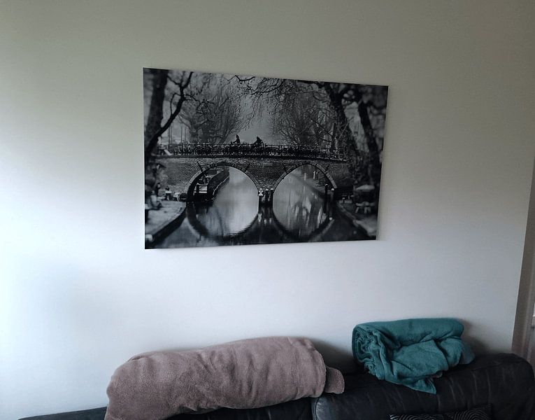
Weesbrug
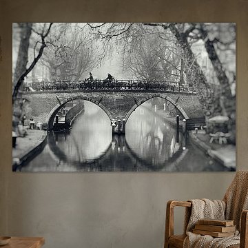
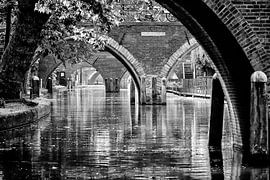
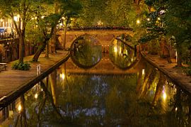
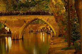
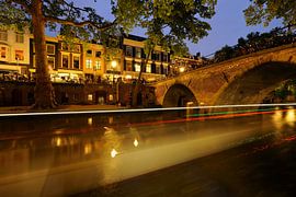
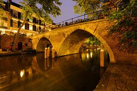
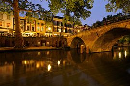
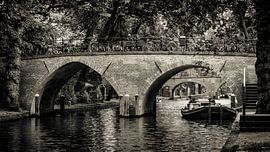
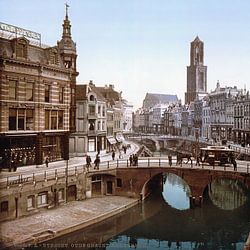
The Weesbrug captures Utrecht's quiet charm like few other landmarks can. This historic canal bridge, arching gracefully over the Oudegracht, appears in photographs that balance serenity with architectural beauty - often rendered in calming monochromes or warm autumn tones that suit minimalist and Scandinavian interiors alike. Works like Street photography in Utrecht. The Weesbrug over the Oudegracht in Utrecht in black and white (2) show how black-and-white imagery emphasizes the bridge's timeless symmetry, while Smeebrug over the Oudegracht in Utrecht celebrates evening light on water.
At Art Heroes, every piece arrives custom-made and ships free. Explore the collection as Canvas, ArtFrame™ and more - whatever fits your space.
-
More artworks below this tip
Hang canal scenes where you pause and reflect
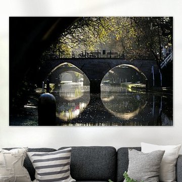
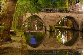
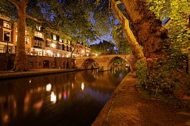
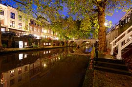
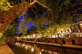
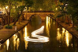
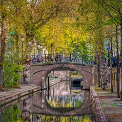
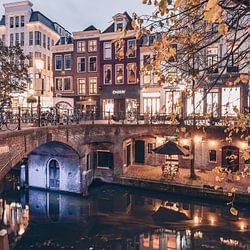
Canal photography captures quiet, contemplative moments. These artworks suit spaces where you naturally slow down - a reading corner, a hallway landing, or above a console table in your entryway. The melancholic mood in Raindrops on the railing of the Weesbrug in Utrecht ovder the Oudegracht canal creates a thoughtful atmosphere that encourages you to pause.
RosanneStylist & Customer service Questions? Check out our FAQ
 -
More artworks below this tip
Pair warm autumn tones with natural materials
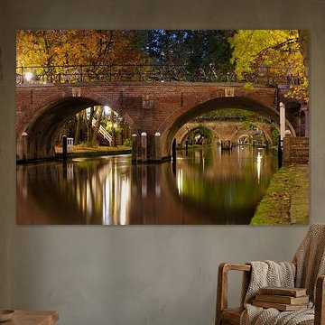
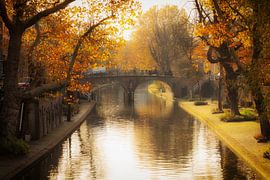
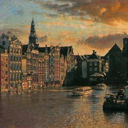
Autumn colours bring warmth to your interior when combined with natural textures. The bronze and taupe shades in Autumn in Utrecht, De Geertebrug over the (G)Oudegracht in Utrecht in the autumn light. pair beautifully with wooden furniture, wicker baskets, or terracotta accents. This creates a cohesive, grounded look that feels calm and inviting throughout the year.
AnouschkaArt Stylist Questions? Check out our FAQ
 -
More artworks below this tip
Place nostalgic scenes in personal spaces
Nostalgic, calm imagery works especially well in bedrooms, home offices, or cosy living areas where you want a peaceful mood. The serene canal views blend into the background without demanding attention, making them ideal companions for spaces where you relax, work, or spend quiet time.
AnthiStylist & Customer service Questions? Check out our FAQ


Trusted and loved
Customers rate us 4.8!
High-quality materials
Sustainable and long-lasting beauty
Different sizes
From small to large, anything is possible.
Made for you
Made the moment you order.


More like this

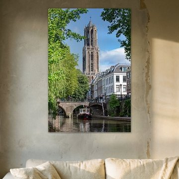
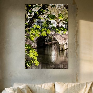
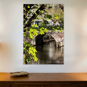
Where does the Weesbrug collection work best in portrait format
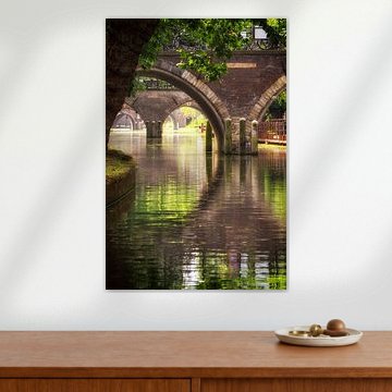
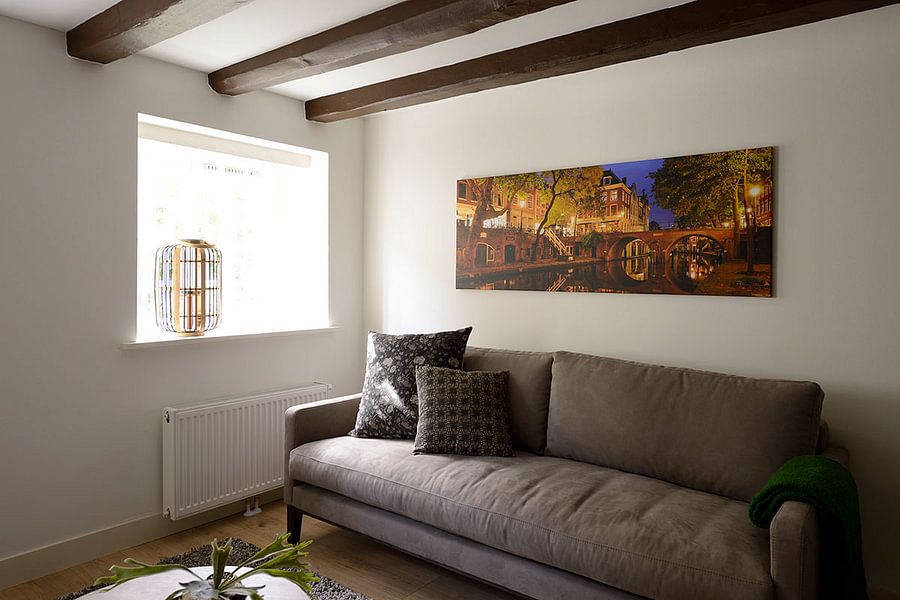
Weesbrug looks especially striking in portrait format, making it an excellent choice for narrow walls or spaces between windows. This vertical orientation works beautifully in hallways, next to doorframes, or above console tables in your entrance area. If you're working with a wide wall above your sofa or sideboard, consider a landscape format instead to fill the space more naturally.
Choosing the right material
Weesbrug comes to life on each of our premium materials. Whether you choose Canvas, Poster, or ArtFrame™, each enhances the unique details and colors.
Choose Canvas and you benefit from two key advantages that complement this collection perfectly. First, the classic material brings an authentic feel to your space, particularly suited for photography with its traditional texture. The canvas texture works beautifully with the brown, taupe, and olive green tones that define Weesbrug, adding depth to the calm and nostalgic mood of the imagery. Second, you can personalize your finish with multiple edge wrap and thickness options. The mirrored or continuous edge wrap helps the romantic atmosphere extend around the sides, while the 4.5 cm thickness option adds extra presence to larger formats.
Still doubting which material suits your interior and chosen Weesbrug artwork? Use our material comparator to find the perfect match for your space.
Which interior styles match Weesbrug colors
Weesbrug fits naturally into rustic and Scandinavian interiors thanks to its earthy color palette. The brown and bronze tones work well in country-style spaces with wooden furniture and natural textures, while the beige and taupe shades blend seamlessly into Scandinavian rooms with light woods and neutral fabrics. Pair the olive green hues with linen textiles or rattan accessories to create a cohesive, organic look throughout your room.
