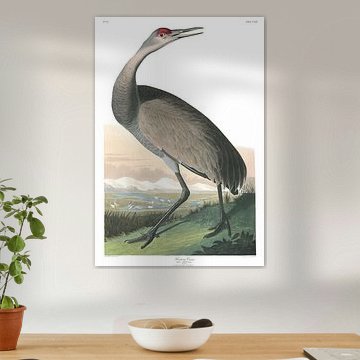
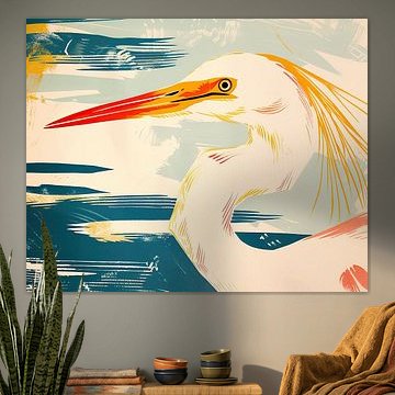
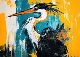
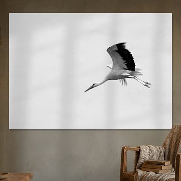
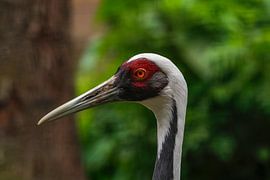
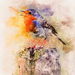
Cranes
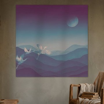
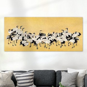
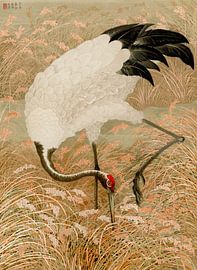
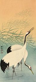
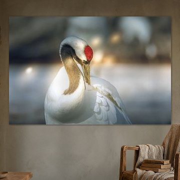
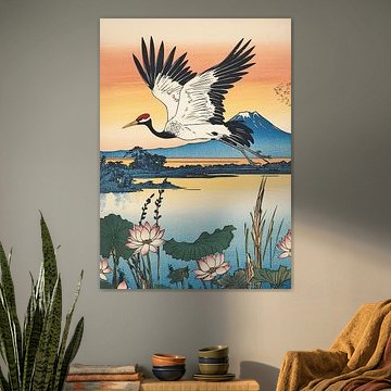
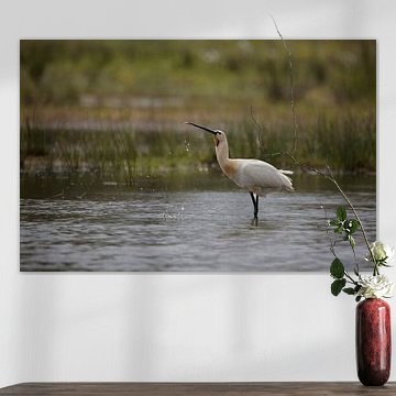
Cranes bring elegance and serenity to any space. Their graceful forms and calm presence create a peaceful atmosphere that complements both modern and traditional interiors. From moonlit scenes to golden backgrounds, these artworks capture the timeless beauty of these majestic birds - like the serene composition in Crane, where delicate details meet mystical depth.
At Art Heroes, every piece is custom-made by talented European artists. Choose your preferred size and material - ArtFrame™, Canvas, Poster and more - and we'll ship it to you for free.
-
More artworks below this tip
Pairing cranes with your room
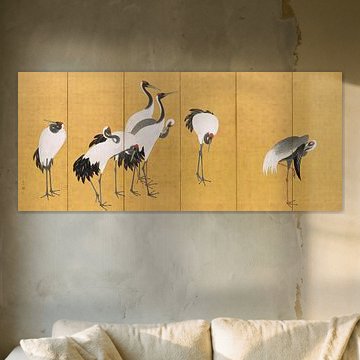
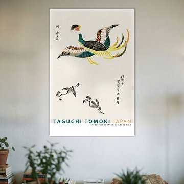
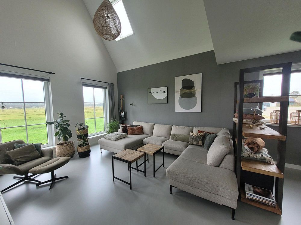
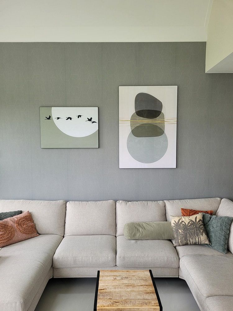
The calm, elegant nature of crane artwork suits quiet, thoughtful spaces. Think bedrooms, reading corners, or home offices where you want to encourage focus and tranquility. The golden tones and white plumage in Japanese flock of cranes, Ishida Yūtei work beautifully in rooms with natural wood furniture or warm textile accents.
LianneStylist & Customer service Questions? Check out our FAQ
 -
More artworks below this tip
Choosing the right format
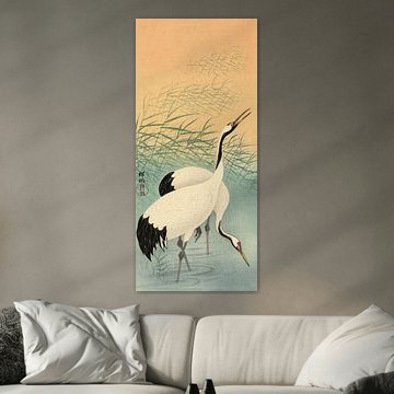
Portrait and square formats are equally popular for crane artwork. Portrait works well in narrow wall spaces like hallways or beside doorways, while square prints suit symmetrical arrangements above console tables or beds. Choose the format that fits your available wall space and surrounding furniture layout.
EileenStylist & Customer service Questions? Check out our FAQ
 -
More artworks below this tip
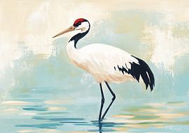
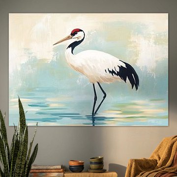
Working with warm neutrals
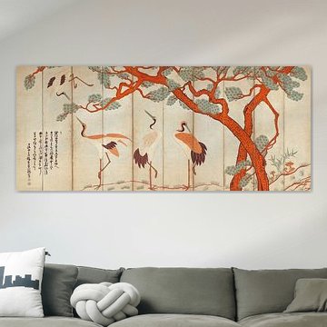
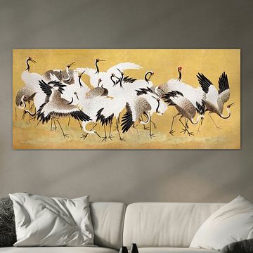
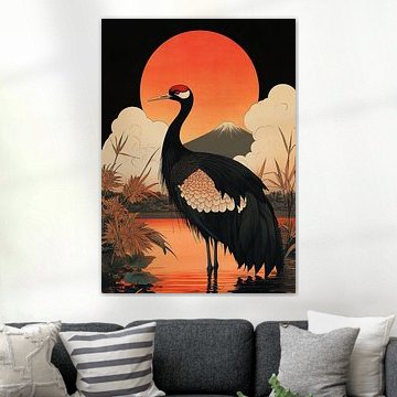
Taupe, beige, and brown are the dominant colors across crane artworks, making them easy to pair with existing interiors. These earth tones complement natural materials like linen, rattan, and oak. The warm palette in Crane painting. pairs well with terracotta accessories or soft cream-colored walls for a cohesive look.
AnthiStylist & Customer service Questions? Check out our FAQ


Trusted and loved
Customers rate us 4.8!
High-quality materials
Sustainable and long-lasting beauty
Different sizes
From small to large, anything is possible.
Made for you
Made the moment you order.
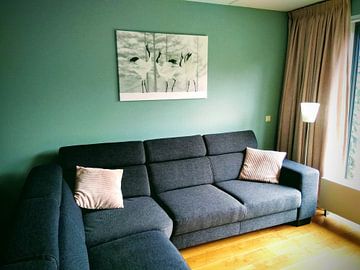
How they hang in other homes
Get inspired by beautiful artworks on other people's walls and see how they truly enhance an interior.


More like this


Which format works best for cranes artwork?

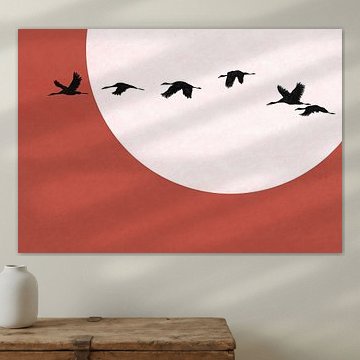
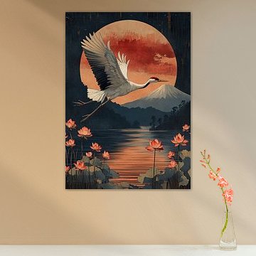
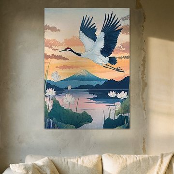
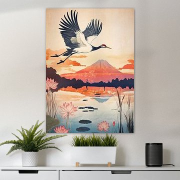
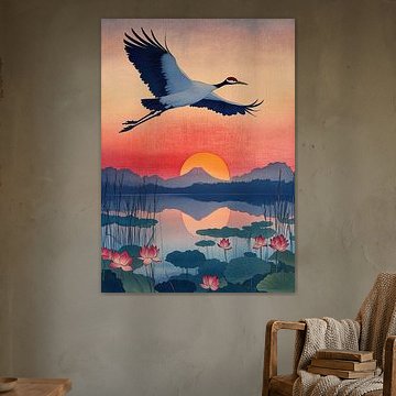
Cranes work beautifully in portrait format, which emphasises their elegant, vertical posture and long necks. A tall piece suits narrow walls beside doorways or in hallways where vertical space helps draw the eye upward. You can also hang portrait cranes above a console table or sideboard to create a balanced focal point. If you have a wider wall above your sofa or bed, consider a landscape format instead - it captures cranes in flight or standing in pairs across wetlands.
How cranes complement calm, natural interiors
Cranes bring taupe, beige, and soft brown tones that fit naturally into Scandinavian and minimalist interiors. These earthy colours pair well with light wood furniture, linen textiles, and neutral walls, creating a calm and grounded atmosphere. If your cranes artwork includes blue or bronze accents, try combining it with warm brass lighting or cool-toned ceramics to enhance the natural palette. The result is an elegant, uncluttered space that feels both powerful and serene.
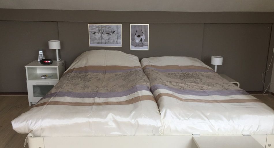
Why cranes work well in your bedroom
The bedroom is a good spot for cranes artwork. Their calm and elegant mood supports a restful atmosphere, making them ideal for the wall above your bed or on a feature wall opposite. Cranes are often associated with grace and tranquility, which helps set a peaceful tone as you wake and wind down. Choose Canvas for a soft, traditional finish, or opt for Poster if you prefer a lighter, more affordable option that's easy to swap seasonally.
