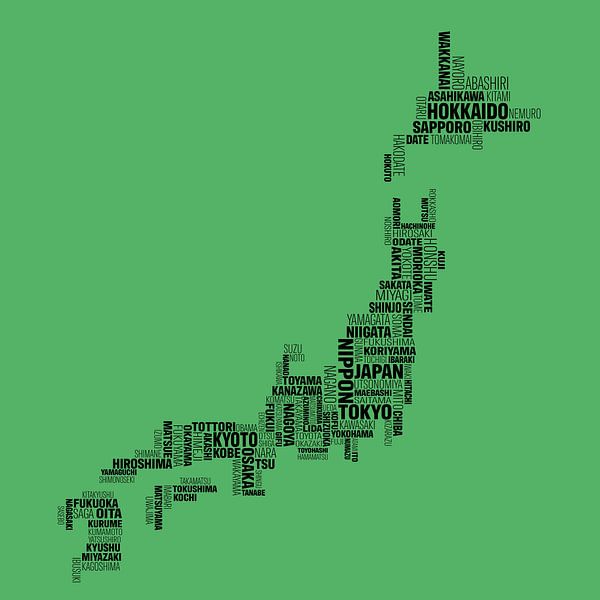
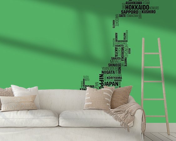
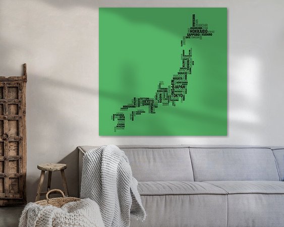
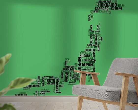
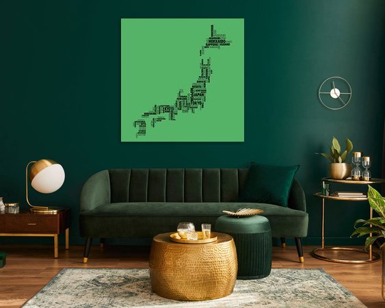


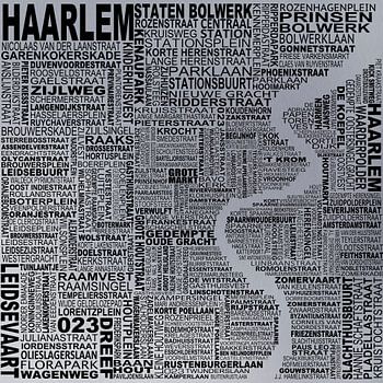
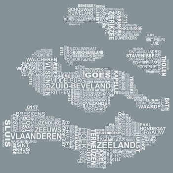
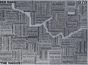
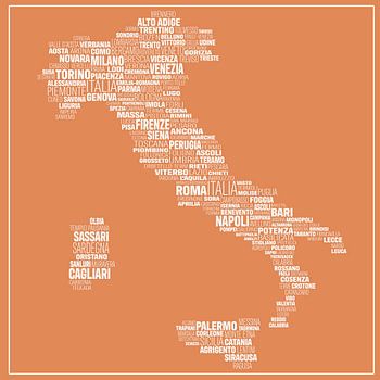
About ‘Japan Typography’ by Stef van Campen
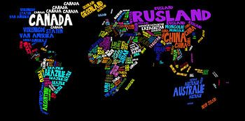
This typographical map has been compiled with extreme care. Each place name has been manually placed, rotated and scaled to precisely form the contours of the land. It is a creative process that takes much more time than it first appears: every curve, island shape and coastline requires precise typographic balance.
Dozens of small…
Colors
Discover our ArtFrame
The modern canvas alternative
Your chosen art on a textile print, stretched in an aluminum or wooden frame. Quick and easy to change for a fresh look and exactly as you want it.
- High-quality print
- Easily replaceable
- Acoustic function
- Large formats possible

Discover the artworks of Stef van Campen


Customer reviews
4.8/5

Related collections